
Although it has been said that “there are lies, damned lies, and statistics,” surely the real danger lies in having too few statistics, not too many. The more you know, the more likely you are to get closer to the truth.
With that in mind, I want to recommend a fabulous website: Our World In Data (https://OurWorldInData.org). You’ll find in-depth, data-driven articles on many social and political issues. Most of the data are in graphs, many of them animated, so you can just look at the pictures if you choose.
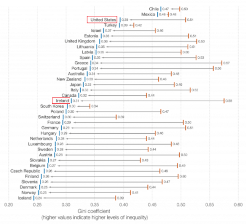
For example, here’s one that shows the income-inequality situation in many leading countries before and after redistributive tax policies are accounted for. The orange bar marks the Gini coefficient before redistribution and the blue bar after. A bar farther to the right indicates more income inequality, not necessarily more income. I know the graph is hard to read here. Click on it to jump to the article and then scroll down a little to see the graph.
You can see at a glance that incomes in the United States are a little more unequal than most countries’ before taxes, but our minimal redistribution leaves us among the most unequal after taxes. On the other hand, Ireland starts out the most unequal, but its policies put Ireland in the middle of the pack after taxes.
I hope you enjoy Our World in Data. It’s a very enlightening site.

